

OINK is the creator owned project of artist John Mueller. This blog documents the creation of this new edition. The new book will be available in 2014. The new art will be posted here as it's created, comment, critique, and discuss with creator.
Saturday, August 11, 2012

Thursday, August 9, 2012

Wednesday, August 8, 2012

Sunday, April 17, 2011

Sunday, February 13, 2011
Jury of your peers

I'm working through a couple of things, I haven't done a page in almost a month, gah! I had so many things hit me at once I'm still just trying to keep my head above water. One of the things that came up was I had to serve on a Jury for a week in a civil case! While this was an educational experience the timing was bad, anyway I had to just paint today for a bit of sanity, this is what came out...I think it's the jury. I kept on thinking of that movie Twelve Angry Men.
Sunday, January 16, 2011
My drawing tools
I got a very nice letter this week from a fellow artist following my blog. He asked about my tools and it's something that's really taken a number of years to get materials I like to work with, everyone is different, half the fun of being an artist is trying new tools! When I was a kid the art store was my church, I can spend hours perusing a good art store.
My digital tools.
I draw on a Wacom 21X Cintiq.
Windows 7 PC- Intel Core Q9450 @ 2.66 GHZ
4GB of memory
Second Monitor is a 24" Dell Ultra Sharp
I use Photoshop CS3
I use Jaime Brushes *you can find them by googling Jaime Jones Photoshop Brushes. It's a great tool set and I've found it has everything I need.
Overall with all my tools I've tried to keep it simple over the years. I usually have 1 or 2 tools in any medium that I do 90% of the work with. The same is true with color and paint, the best workflows are simple.
Eraser sheild for cleanup of my layout
Helix Auto Eraser
Staedtler eraser
Color Erase for rough layout
Staedtler 2h for shading and roughing in the line
Mechanical Pencil with a B lead, I use the manual one for fine details.
I use Staedtler Pigment Liners .01-.05
Standard Sharpie fat and thin markers
Any 'white out' type marker for ink corrections
A standard toothbrush for splattering *not pictured here
I use the Creative Mark brand of paint brushes
I use 2 flat sizes for 90% of my painting a size 4 and 6
I use rounds size 1 for detail work
The palette knives are for impasto FX which is what I use the Impasto paste for, I use a flat and a angled blade.
I use Derivan Matisse Acrylics and mediums.
The types of mediums (the white jars) are a Retarder (keeps paint wet longer), Acrylic Painting Medium, Impasto for building up the surface, and the Varnish is a final coat application when a piece is done.
 Surfaces- I like to paint on 3 ply Strathmore cold press (rough texture) Bristol Board, it has a little round stamp on the corner you can't miss it. I've also taken to canvas recently, but Bristol is my standard.
My digital tools.
I draw on a Wacom 21X Cintiq.
Windows 7 PC- Intel Core Q9450 @ 2.66 GHZ
4GB of memory
Second Monitor is a 24" Dell Ultra Sharp
I use Photoshop CS3
I use Jaime Brushes *you can find them by googling Jaime Jones Photoshop Brushes. It's a great tool set and I've found it has everything I need.
Overall with all my tools I've tried to keep it simple over the years. I usually have 1 or 2 tools in any medium that I do 90% of the work with. The same is true with color and paint, the best workflows are simple.

Eraser sheild for cleanup of my layout
Helix Auto Eraser
Staedtler eraser
Color Erase for rough layout
Staedtler 2h for shading and roughing in the line
Mechanical Pencil with a B lead, I use the manual one for fine details.
I use Staedtler Pigment Liners .01-.05
Standard Sharpie fat and thin markers
Any 'white out' type marker for ink corrections
A standard toothbrush for splattering *not pictured here

I use the Creative Mark brand of paint brushes
I use 2 flat sizes for 90% of my painting a size 4 and 6
I use rounds size 1 for detail work
The palette knives are for impasto FX which is what I use the Impasto paste for, I use a flat and a angled blade.
I use Derivan Matisse Acrylics and mediums.
The types of mediums (the white jars) are a Retarder (keeps paint wet longer), Acrylic Painting Medium, Impasto for building up the surface, and the Varnish is a final coat application when a piece is done.
Surfaces- I like to paint on 3 ply Strathmore cold press (rough texture) Bristol Board, it has a little round stamp on the corner you can't miss it. I've also taken to canvas recently, but Bristol is my standard.
Sunday, January 9, 2011
Page of the Week!
 I bitched and moaned on the idea of this page internally, mostly because I thought it was going to be a lot of work, and I'm always intimidated by city or large environment shots...what artist isn't. It turned out to be a lot of fun and a nice challenge and I actually don't hate the results!
Saturday, January 1, 2011
Page of the Week

I had these huge ambitions over the break, mostly I just relaxed a bit, played a ton of games that piled up over the very busy last year, and decompressed...but I did manage to reorganize my website, and do a new page! The lettering is busting my ass...gah, so much text on these pages. I'm also offering up my very first print from my website, you can order here, so if you like what you've been seeing here, show your support and have your very own Mueller art print...at a very affordable price I might add.
Monday, December 27, 2010
Page of the week
 I've been knee deep in lettering the last couple of weeks, going back and lettering all the pages in my hand script, oy! There is a reason people use fonts, haha, but I'm really happy with the look of them so...what's a few more hours!
Monday, December 13, 2010

Thursday, December 9, 2010


Wednesday, December 8, 2010
Drawing letters

I took a type class in college where the teach made us spend an entire semester hand painting a single word in Helvetica with plaka...it was probably one of the hardest classes I ever had, she was a font Nazi. I think the hardest part was during the class I thought it was completely pointless...turned out it wasn't! I've really been looking at different approaches to lettering...I did the original with a croquil dip pen, on acetate like an animation cel, I liked the slick surface...but dang was it messy and hard to tweak. This page was the first 'talking heads' page I've done since I started this and it was challenging. I've ditched the font computer lettering for hand drawn letters, and I couldn't be happier about the switch. It's definitely more work but it has the character of the orginal...but more legible, haha.
Saturday, November 27, 2010
Pages of the week


I managed to keep pace, this next sequence should go pretty fast because it's a talking head sequence. I think I've decided to hand letter it, I think digital letters might be 'too digital' for my taste.
Sunday, November 14, 2010
2 fer' week!

 It's fun to go back to these pages that truthfully I didn't spend much time on in the original and level them up a bit.
Friday, November 12, 2010
Pagina de Semana

 These quiet pages are interesting to work on, I've learned a lot about color and mood over the years and it's fun to put that to work on something you did so long ago.
Saturday, November 6, 2010
Page O' da' week!

I'm almost done with this first action sequence, this is about in the middle of the book. I wanted to start there and work my forward, and do the first part of the book last. I seem to always get 'better' or maybe more focused, less experimental, toward the last sprint in a series. I want the first chapter to really smash people in the face....as much as a comic is capable of such a thing. Once the this first sequence is done I'll put a PDF together, so you can read the past 2 months of work in context. I'm really happy with it, which is unusual. I'm still enjoying this a great deal.
I've been reading a lot about digital distribution. I had the thought today that this is an excellent opportunity to lead with a digital only version. Obviously I'm a big fan of digital, Mark Waid is very passionate about the subject, and I agree with his suprisingly controversial idea, we as creators need to lead the charge, it's an opportunity to recapture our distribution, digital is currently a level playing field. I can get as much exposure as the newest X-men on Comixology. I'm all for a new business model for comics. The current one is just not sustainable or good for anyone, especially graphic novel guys like me. With Oink I could see offering the first 32 pages for free, and the entire graphic novel for 9.99, rather than the 19.99 price tag the original carried. Personally, I think comics are the worst entertainment dollar you can currently spend, take video games for example. In a video game you get minimum of 8 hours up to...hundreds of hours of entertainment for $59.99. If you break it down hour by hour, at it's worst case it ranges from $7.00 per hour to pennies if you play something like Fallout 3 for a hundred hours like me. Entertainment money is disposable income, and it's more about bang for your buck.
Comics are more like an album, but typically you listen to a song more than once, but rarely will you read a comic more than once...so even in that comparison you still get more value from a 1.99 song than you do a 4.95 comic that takes up space in your basement.
I think we would have a lot more fans if the price point dropped to .99 or 1.99 for digital. I think the creators can make more money with increased volume and a lower overhead on materials..and almost no cost for distribution. When you buy a comic for $4.95 the pie chart on where that money goes would make your head spin, everything from the paper suppliers, to the shipping cost of the books to the shops, to the guy ringing the register, it all factors in.
I love my local comic shop here, Austin Books. I'm viewing this as a creator who was driven out of comics because of the business model couldn't sustain a creator like me. I'm not a volume type of guy. I get one good idea every few years worth exploring, and I would spend probably 2 years per 100 pages of art and story..and I don't want to paint other peoples stuff, I just don't have any passion for that.
Consider this, I would say a $5.00 cup of coffee at Starbucks has the same entertainment value per dollar, as far as time/money sink, and look where they are right now in this economy...now imagine you want to drink 20 cups of $5.00 coffee a week, it would put anyone in the poor house fast, it punishes your consumer. I remember my last series Blood & Circus was sold for 4.95 for 24 pages of art and story, and because I'm artsy I don't use a lot of text...so you could blow through an issue in less than 10 minutes! I thought they were mad...mad as hatters! They had to though in order to make money, it cost them almost $2.00 per book just to print! Personally I would only see about 0.25 of that per copy! If you ever wonder why I left the wonderful medium of comics...I've never been a believer that creators should have to suffer for their art....poets...poets suffer for their art.

Sunday, October 31, 2010
Page of the week
 Some pages are harder than others, I re-drew half the page on this one. I think I crunched too much action into too few panels in the original, and the panel layout was unbalanced. I still don't like that Judas' action isn't really resolved. The original scene Loki falls ontop of him after Oink blows his head off...not sure if it matters. I like the way the digital re-work of the page came out, considering I was feeling a big lethargic this week....I blame the new Fallout Vegas game!

Sunday, October 17, 2010
This ones for you blue pig...sorry about that.
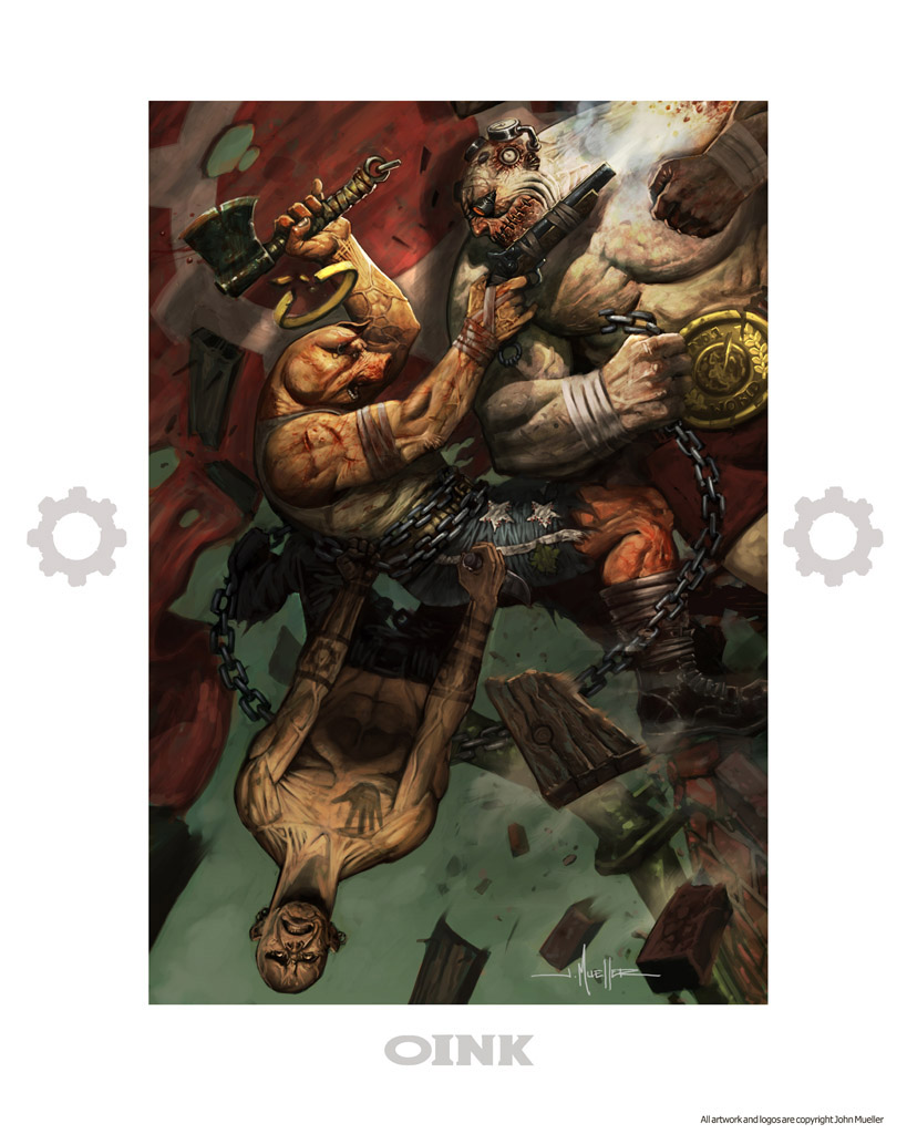
 This is the culmination of Oink's first encounter with the Angels of Mercy, the main bad guys henchman in the series. I really had a lot of fun with this, the pages are going surprisingly fast. This is one of my Frank Miller homage pieces, when I began writing the series I was deeply inspired by Sin City.

Sometimes I have to go google image search reference, googling anything with the term pig in it will get back some truly heartbreaking stuff. This noble beast was tortured at the hands of some employee's at the Hormel factory farms, look in his eye and tell me there isn't a soul there, and he's totally telling god what we did to him. This kind of treatment of pigs is VERY common, factory workers in the US often times severly abuse and beat these animals, and very little is done to the offenders. It's not enough we raise them in grossly over crowded food farms, can't we let them die with some dignity. This is a far cry from the 'local farmer' we all imagine is raising our meat.

Thursday, October 14, 2010
Run for the light, run for your life.
 It's really fun to be able to reinforce the story, and not have that constant weight of 'oh, my god, I need to finish this.' I'm also approaching every page with this is the LAST time I'll do this, so get it right...haha. FOR REAL THIS TIME!

Saturday, October 9, 2010
two-fer-week
 I had a productive day, this thing popped out of nowhere. I started roughing the layout in and I just started have a lot of fun with it. I'll probably still pick on it over the week. There was quite a bit of redrawing on this page, but that didn't seem to slow me down.

Subscribe to:
Posts (Atom)